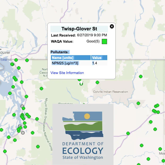
What are these monitors measuring?
We don’t have a ton of cars or industry around here, but we do generate our fair share of smoke. Our local pollutant of concern, PM2.5, is shorthand for particulate matter 2.5 microns or smaller in diameter. For reference, a human hair is about 60-80 microns in diameter. These really small particles suspended in the air come from incomplete combustion, or burning. Some are generated from car exhaust, but most are from smoke, such as woodsmoke from home heating in the winter, or forest fires in the summer. Visit Health page for more information.
What do the numbers mean?
The air quality monitors suck air into the instrument and bounce a laser beam off the particulate matter in the air. The instrument then counts how many particles are present in a certain volume of air depending on how the light is refracted, or bent. A concentration of PM2.5 (by weight) in a cubic meter of air can then be calculated.
What do the colors mean?
The numbers are associated with colors that change from green to yellow to red (and beyond) as air quality gets worse, as a way to visually comprehend how bad the air is for you to breathe. Washington Department of Ecology has a great description of what actions you can take at the different levels to protect your health. Visit PDF.
Why are the numbers on the WA Ecology site and AirNow.gov site different than the Purple Air site?
Each monitor detects how many particles are in the air at the exact location of the instrument, and air quality conditions may be different not that far away. However, if you noticed that our Purple Air monitor numbers are slightly different than the WA Ecology and AirNow.gov monitors in the same location (co-located at the Winthrop library and Twisp town hall), good for you to pay such close attention!
In this case, the numbers are different for a couple of reasons.
Fancier instrument. The WA Ecology and AirNow.gov monitors are much more expensive instruments called “nephelometers,” and are more accurate and precise than the Purple Air monitors.
Real-time versus 24h average. When you look at online data from Purple Air monitors, the default display is the concentration of particles they are measuring every 80 seconds and represent real-time conditions. In contrast, the WA Ecology monitors calculate a 24-hour rolling average of particle concentrations. This is because the studies done looking at serious health risks of air pollution focused on what would happen if you breathed those levels for 24 hours. The method WA Ecology and AirNow.gov uses to find the 24-hour average is called the “Now-Cast” method.


